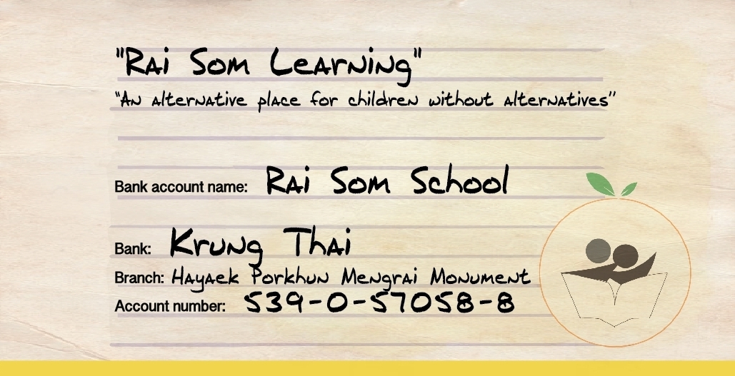
![]() P'San has spent the last few weeks coming up with a variety of logo options, which the team has been mulling over. We wanted something which is not only pleasing on the eye, but also has a message and meaning.
P'San has spent the last few weeks coming up with a variety of logo options, which the team has been mulling over. We wanted something which is not only pleasing on the eye, but also has a message and meaning.
The elements each have significance:
Design
- The circle and leaves represent the location - orange orchards predominate
- The people reading the book represent the ethnic groups, disabled students, and mix of ages which make up the students at the school
- The book itself represents the wish of the students to study, in order to improve their lifestyle, the surrounding environment, and retain their culture through learning and fun
Colours
- Yellow signifies the location - the orange orchards which surround the school
- Green pertains to the environment, as well as signifying friendship
the text at the bottom, if you can't read Thai, is the name of the school (which is significantly longer than the English translation!)